After reviewing early layouts with the client, I refined visual pacing, adjusted image hierarchy, and simplified the inquiry process—ensuring every step felt smoother, clearer, and more aligned with the brand’s tone.
Catering Experience Website
Harmonia
Haymisha Catering
Overview
Harmonia is a high-end catering service that needed a website to reflect their culinary elegance and event expertise. The main goal was to allow users to browse menus, view event inspiration, and quickly get in touch to start planning an event.
The Challenge
Build a visual-first website that communicates the brand’s luxurious food experience, guides users through service categories, and leads them smoothly toward initiating contact – without overwhelming them with information.
My Role
UX strategy
User flow & Wireframes
Visual design and layout
Copy hierarchy and CTA optimization
UX/UI design
As part of the UX strategy for Harmonia, I focused on crafting an experience that reflects the brand’s high-end catering services while remaining emotionally engaging and easy to navigate. My research included analyzing premium hospitality and event service websites, identifying how they build trust, showcase quality, and guide users toward conversion.
The main challenge was creating a sense of atmosphere and warmth—not just presenting menus, but conveying the experience of an elegant event. I asked:
What makes a user feel inspired to inquire?
How do we highlight the food without overwhelming the layout?
Can we turn browsing into an emotional journey?
Based on these insights, I:
✔ Designed a homepage that feels immersive and story-driven
✔ Organized services by event type for clearer decision paths
✔ Used large, elegant imagery balanced by soft, structured typography
✔ Created a contact and inquiry flow that feels personal and effortless
The result is a refined, content-driven website that invites users to explore, imagine, and connect—mirroring the essence of a beautifully planned event from the very first click.
User flow
Homepage → Explore services (private/business) → View gallery or menu highlights → Scroll to contact form → Submit inquiry
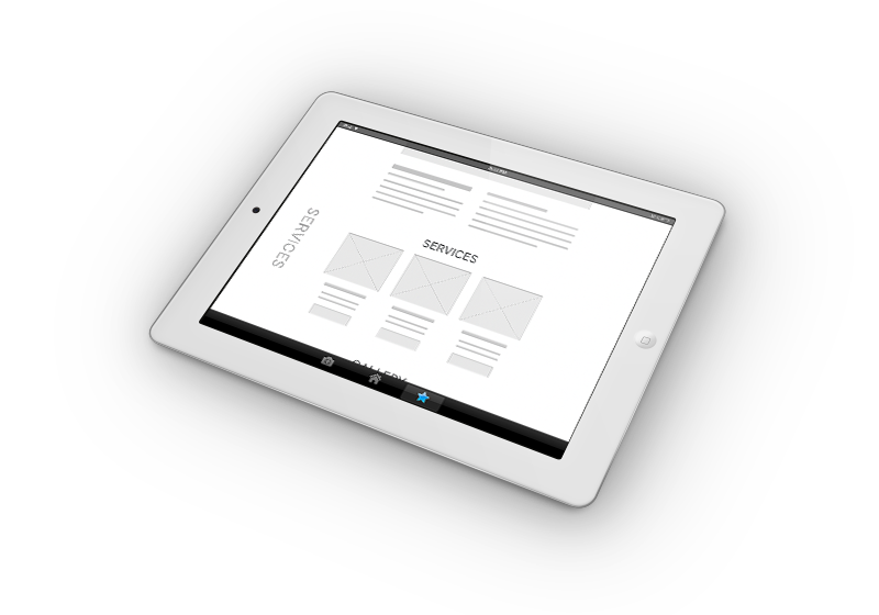
wireframes
Outlined sections to guide the user emotionally: from large imagery → service explanation → social proof → contact.

Visual design and layout
The visual design of the Harmonia website was guided by elegance, intimacy, and a sense of crafted hospitality. I chose a restrained, refined color palette—earth tones, soft whites, and deep accents—to evoke natural textures and culinary warmth.
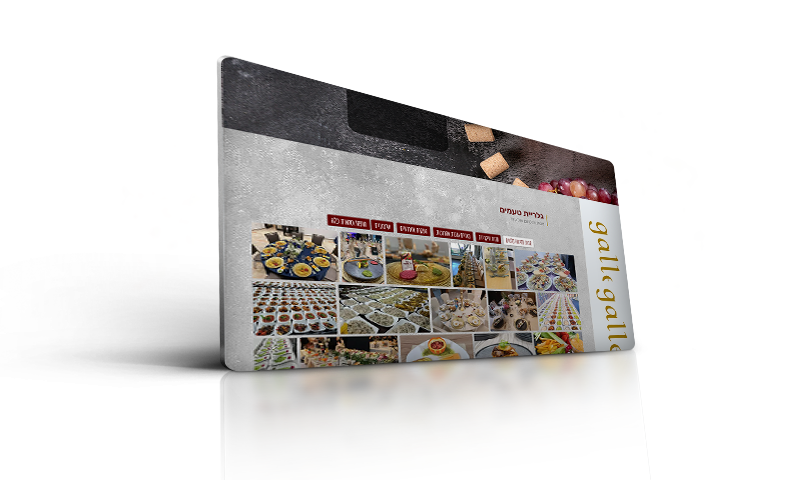
The layout was intentionally editorial in feel: large full-width images set the mood, while clean typographic sections provide breathing room between visual storytelling and practical content. Each screen was designed with hierarchy in mind, allowing users to effortlessly absorb information—whether they’re casually browsing or actively seeking to plan an event.
To enhance emotional engagement, I placed visual emphasis on event settings, food styling, and service ambiance—bringing the user closer to the feeling of the Harmonia experience. Subtle transitions, generous margins, and minimalistic iconography help sustain the boutique aesthetic without distracting from functionality.
The result is a layout that feels both high-touch and accessible—inviting users to linger, scroll, and imagine their event, all while supporting seamless navigation and inquiry.
Copy hierarchy and CTA optimization
I structured the site’s content to guide users from emotional inspiration to confident action. Headlines were crafted to evoke elegance and trust, while CTAs were placed with intention—subtle yet clear, encouraging inquiries without disrupting the visual flow.
This balance supported both early-stage browsing and direct conversions, all within the tone of boutique hospitality.
“Working with Chaya was effortless and inspiring. She understood our vision from the very first conversation and translated it into a digital experience that feels elegant, calm, and perfectly on-brand. The result isn’t just a website—it’s a reflection of who we are. Our clients love it, and so do we.”
— Aryeh Neiman
Harmony Catering
Takeaways
When designing for emotion and aesthetics, less is more. Guiding the user through storytelling and visuals increases trust and conversion in the catering/event industry.