Online Socks Boutique
SAYSOCKS
Haymisha Catering
Overview
SaySocks is a boutique e-commerce brand specializing in high-quality socks for women, men, and children. The website is designed for smooth browsing and a seamless purchase experience.
The Challenge
To create a responsive, user-friendly online store that supports a large and diverse inventory, offers size and color variations per product, and simplifies the purchase process.
My Role
UX/UI design
User flow
WordPress web design
E-commerce optimization
UX/UI design
As part of the UX/UI design process, I analyzed multiple fashion and accessories e-commerce websites, with a focus on fast, mobile-first shopping flows. I paid particular attention to layout clarity, visual merchandising, and how brand personality is conveyed through minimal design decisions.
My goal was to understand how to make small products feel big—how to give socks emotional appeal, make gifting feel joyful, and guide the user from curiosity to conversion in under 3 clicks.
I stepped into the user’s mindset:
What makes me stop scrolling and click?
How can I easily explore without feeling overwhelmed?
How do I add the right size to my cart without second-guessing?
Based on these insights, I:
✔ Designed a highly visual homepage with strong entry points into key categories
✔ Prioritized product cards with clear CTAs and size options
✔ Optimized the mobile navigation and filter flow
✔ Created a playful yet clean interface that reflects the brand’s energetic tone
The result is a user journey that feels fast, fun, and frictionless—supporting impulse buys, gift purchases, and repeat customers alike.
User flow
Homepage → Browse by category → Select product → Choose color and size → Add to cart → Review cart and choose shipping method → Checkout.
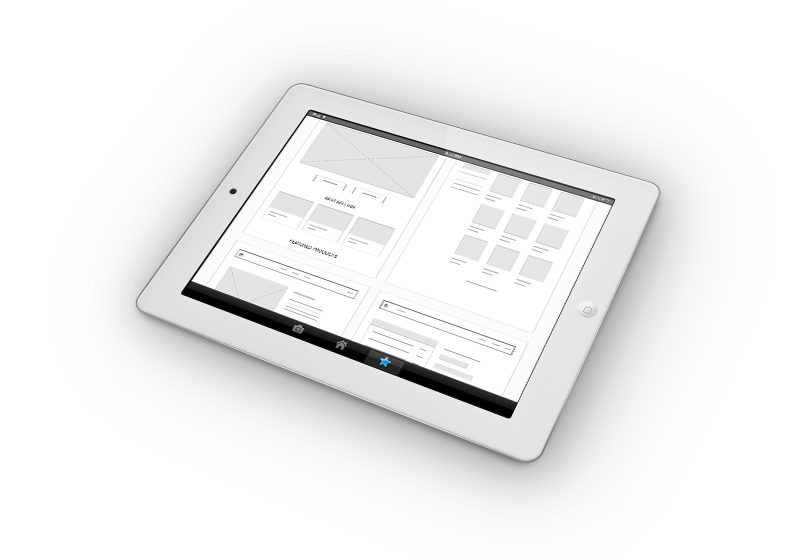
wireframes
Created black-and-white wireframes to define content structure and emphasize hierarchy without distraction.

WordPress web design
The WordPress design for SaySocks was crafted to balance vibrant brand personality with a streamlined, responsive e-commerce experience.
I created a playful yet structured visual environment—one that feels energetic and modern, but never chaotic. Bold color blocks, clean product grids, and dynamic hover effects help highlight the products while keeping the interface crisp and easy to use.
Each page was designed with mobile-first behavior in mind, ensuring fast loading, thumb-friendly controls, and clear CTAs throughout. The product and cart pages were kept intentionally minimal, letting the socks shine while maintaining clarity during selection and checkout.
The user journey supports both quick shopping (e.g., “add and go”) and more casual browsing—like scrolling through curated gift sets or limited editions. Every element in the layout was aligned with the brand’s fun, friendly tone, while preserving professional usability and performance on WordPress.

E-commerce optimization
I optimized the shopping experience by minimizing friction across the funnel—from product discovery to checkout. This included simplifying the cart view, enabling one-click size selection, and reducing visual noise during checkout.
I also implemented dynamic cart updates, mobile-friendly filters, and clear prompts to encourage add-on purchases, all tailored to drive conversions without overwhelming the user.
“Working with Chaya was one of the best decisions we made. She immediately understood our brand’s voice—fun, bold, but clean—and translated it into a shopping experience that our customers love. The site is fast, intuitive, and beautiful. Our sales have grown, and so has the feedback from happy shoppers.”
— JAKOB
SAYSOCKS
Takeaways
Managing complexity in e-commerce design means prioritizing clarity. Variations must be handled elegantly, especially on mobile. The design now supports effortless shopping with strong brand identity.
Iteration
After launching the initial version, I gathered feedback from users navigating the site on mobile. Based on their input, I simplified the cart layout, clarified size selection options, and streamlined the checkout steps—improving speed and reducing drop-off.