Public Services Website
Neve Yaakov Community Center
Neve Yaakov Community Center
Overview
This community center serves the residents of Neve Yaakov with educational, cultural, and recreational services. The website’s purpose is to offer clear access to information, class schedules, and contact forms for families and individuals of all ages.
The Challenge
Design a municipal website that feels both professional and community-oriented. It needed to support multiple audiences (parents, youth, seniors), provide easy access to dynamic content (like activities), and simplify registration.
My Role
UX planning and sitemap structuring
User flow & Wireframe creation
UI styling tailored to family/community services
WordPress layout design
UX planning and sitemap structuring
As part of the UX strategy for the community center website, I focused on designing a structure that reflects the daily needs of families, seniors, and young residents—while making it easy for any visitor to find, understand, and act on relevant services.
My planning process began with mapping common user intents:
A parent looking to register a child for an after-school class
A resident searching for community services or events
A newcomer trying to get in touch or navigate the center’s offerings
I asked:
What types of information do users need most often?
How can we reduce clicks for repeat tasks (like class signups)?
Can we make the site feel organized even when there’s a lot of content?
Based on these insights, I:
✔ Developed a clear, role-based sitemap (services, classes, community, contact)
✔ Created top-level sections with familiar, action-oriented labels
✔ Consolidated scattered content into thematic hubs
✔ Ensured that key actions (like “Register” or “Ask a Question”) are never more than two clicks away
The result is a navigational structure that feels intuitive for a diverse audience—designed not only for browsing, but for practical, everyday use within a busy community.
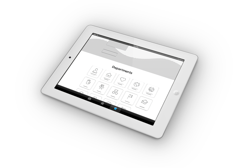
User flow
Homepage → Explore categories (children, teens, adults) → View current programs → Enter activity page → Fill out registration form → Confirmation message
wireframes
Low-fidelity wireframes were created for all core pages, including the homepage, category overview, and individual class registration. Each wireframe emphasized scannability: clear headlines, visual groupings, and space for CTAs at strategic points.
These sketches served as both a visual blueprint for development and a communication tool with the client, helping align expectations before design began.
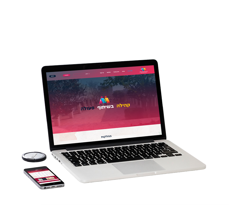
UI styling tailored to family/community services
The visual language was designed to feel welcoming and service-oriented. I used soft shapes, accessible font sizes, and a color palette that balances warmth with municipal professionalism.
Visual hierarchy was optimized to surface key services—like class registration or announcements—without overwhelming users with too many choices. The UI styling reflects the values of the center: clarity, community, and approachability.
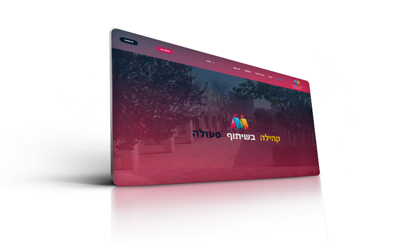
WordPress Layout Design
The site was developed on WordPress using a flexible block-based layout system. Each page was built with reusable design components—such as event cards, service highlights, and registration forms—allowing the admin to easily update content without breaking the visual consistency.
The layout adapts seamlessly to mobile, with collapsible menus, responsive grids, and tap-friendly buttons—ensuring that residents can access information anytime, from any device.
“Chaya approached our website project with incredible sensitivity to our audience and mission. She created a structure that makes it easy for families, seniors, and residents of all backgrounds to find what they need—quickly and comfortably. Beyond design, she brought insight, clarity, and genuine care to every stage. The result feels like a true community space online.”
— Neve Yaakov Community Center
Takeaways
Designing for public sector users requires sensitivity to accessibility, clarity, and emotional engagement. Mobile-first layout and simplified registration encouraged more community members to use the website independently.
Iteration
Post-launch feedback led to refinements in mobile spacing, button visibility, and homepage layout—making the site clearer, faster, and more aligned with users’ real-life needs.